Bhawan
Brand Identity
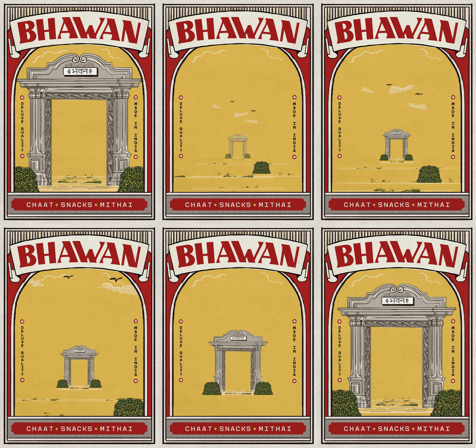
Packaging
Bhawan is Hindi for ‘large hall’, and is often used to refer to old-style buildings that served institutions, housing important people and hosting official purposes. I decided to lean into the retro grandeur of the name, and designed the wordmark in Latin and Devanagri script.
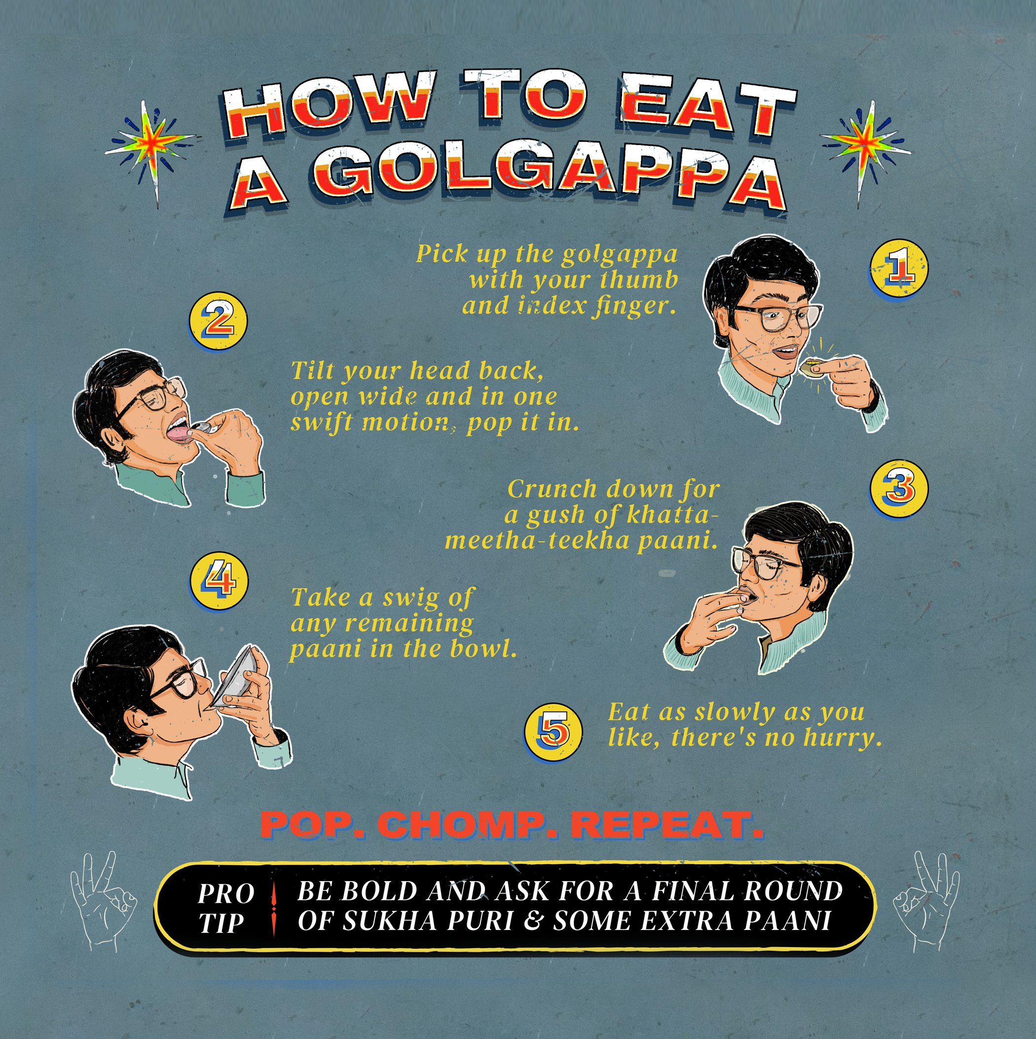
For other collaterals like their menu, signage, and wayfinding, I found inspiration in Indian streetside signage. Their vibrant colours, hand-painted signage with their own minor errors and idiosyncrasies, lends a textured touch to all the restaurant touchpoints. The paper for the menu and the packaging is also rough and ‘unfinished’ as a final homage to this theme.
The restaurant logo makes full use of the
for-the-people nature of its namesake building and its whereabouts. The letterforms evoke retro handmade signage, replete with its own imperfections. Flared serifs, but not quite. Strokes that veer ever so slightly off their path. Mutedly vibrant colors that sometimes overlap. Finally, a very subtle asymmetry helps the wordmark feel authentic to the streets that it began life in.
Bhawan traces its name to the quietly grand Indian buildings made for public use. The menu features retro Indian aesthetic:
the stamps, typography, and illustrations all draw from mid-century colours and textures; imperfect strokes on aged paper.
For packaging and takeaways, we made use of old-school jute bags, known for a ruggedly soft texture. Screen-printing on them often results
in slight print 'imperfections', adding to the charm.
ROLE
Art Direction
TEAM
Creative Direction: Kunel Gaur
Art Direction: Yash Prajapati
Copy: Prakhar Khandelwal
Motion: Pranay Patwardhan
3D: Anubhav Kesarwani
BRAND
Bhawan


